按钮
编辑教程Bootstrap 按钮
本章将通过实例讲解如何使用 Bootstrap 按钮。任何带有 class .btn 的元素都会继承圆角灰色按钮的默认外观。但是 Bootstrap 提供了一些选项来定义按钮的样式,具体如下表所示:
以下样式可用于<a>, <button>, 或 <input>元素上:
| 类 | 描述 |
|---|---|
| .btn | 为按钮添加基本样式 |
| .btn-default | 默认/标准按钮 |
| .btn-primary | 原始按钮样式(未被操作) |
| .btn-success | 表示成功的动作 |
| .btn-info | 该样式可用于要弹出信息的按钮 |
| .btn-warning | 表示需要谨慎操作的按钮 |
| .btn-danger | 表示一个危险动作的按钮操作 |
| .btn-link | 让按钮看起来像个链接 (仍然保留按钮行为) |
| .btn-lg | 制作一个大按钮 |
| .btn-sm | 制作一个小按钮 |
| .btn-xs | 制作一个超小按钮 |
| .btn-block | 块级按钮(拉伸至父元素100%的宽度) |
| .active | 按钮被点击 |
| .disabled | 禁用按钮 |
下面的实例演示了上面所有的按钮 class:
<!DOCTYPE html><html><head>
   <title>Bootstrap 实例 - 按钮选项</title>
   <link rel="stylesheet"
   href="//apps.bdimg.com/libs/bootstrap/3.3.0/css/bootstrap.min.css"
   rel="external nofollow" target="_blank"  rel="external nofollow"
   target="_blank"  rel="external nofollow" target="_blank"
   rel="external nofollow" target="_blank"  rel="external nofollow"
   target="_blank" >
   <script src="//apps.bdimg.com/libs/jquery/2.1.1/jquery.min.js"
   rel="external nofollow"  rel="external nofollow"  rel="external nofollow"
   rel="external nofollow"  rel="external nofollow" ></script>
   <script src="//apps.bdimg.com/libs/bootstrap/3.3.0/js/bootstrap.min.js"
   rel="external nofollow"  rel="external nofollow"  rel="external nofollow"
   rel="external nofollow"  rel="external nofollow" ></script></head><body>
<!-- 标准的按钮 -->
<button type="button" class="btn btn-default">默认按钮</button>
<!-- 提供额外的视觉效果,标识一组按钮中的原始动作 -->
<button type="button" class="btn btn-primary">原始按钮</button>
<!-- 表示一个成功的或积极的动作 -->
<button type="button" class="btn btn-success">成功按钮</button>
<!-- 信息警告消息的上下文按钮 -->
<button type="button" class="btn btn-info">信息按钮</button>
<!-- 表示应谨慎采取的动作 -->
<button type="button" class="btn btn-warning">警告按钮</button>
<!-- 表示一个危险的或潜在的负面动作 -->
<button type="button" class="btn btn-danger">危险按钮</button>
<!-- 并不强调是一个按钮,看起来像一个链接,但同时保持按钮的行为 -->
<button type="button" class="btn btn-link">链接按钮</button>
</body></html>
结果如下所示:

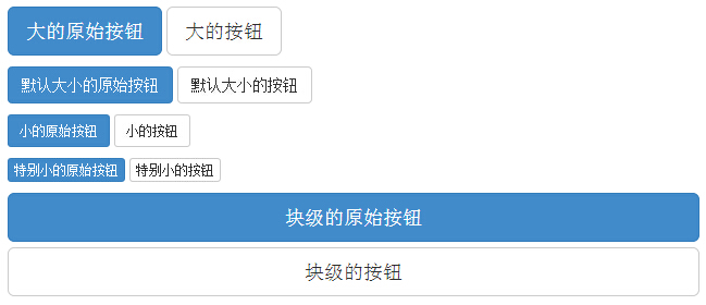
按钮大小
下表列出了获得各种大小按钮的 class:
| Class | 描述 |
|---|---|
| .btn-lg | 这会让按钮看起来比较大。 |
| .btn-sm | 这会让按钮看起来比较小。 |
| .btn-xs | 这会让按钮看起来特别小。 |
| .btn-block | 这会创建块级的按钮,会横跨父元素的全部宽度。 |
下面的实例演示了上面所有的按钮 class:
<!DOCTYPE html><html><head>
   <title>Bootstrap 实例 - 按钮大小</title>
   <link rel="stylesheet"
   href="//apps.bdimg.com/libs/bootstrap/3.3.0/css/bootstrap.min.css"
   rel="external nofollow" target="_blank"  rel="external nofollow"
   target="_blank"  rel="external nofollow" target="_blank"
   rel="external nofollow" target="_blank"  rel="external nofollow"
   target="_blank" >
   <script src="//apps.bdimg.com/libs/jquery/2.1.1/jquery.min.js"
   rel="external nofollow"  rel="external nofollow"  rel="external nofollow"
   rel="external nofollow"  rel="external nofollow" ></script>
   <script src="//apps.bdimg.com/libs/bootstrap/3.3.0/js/bootstrap.min.js"
   rel="external nofollow"  rel="external nofollow"  rel="external nofollow"
   rel="external nofollow"  rel="external nofollow" ></script></head><body><p>
   <button type="button" class="btn btn-primary btn-lg">
      大的原始按钮   </button>
   <button type="button" class="btn btn-default btn-lg">
      大的按钮   </button></p><p>
   <button type="button" class="btn btn-primary">
      默认大小的原始按钮   </button>
   <button type="button" class="btn btn-default">
      默认大小的按钮   </button></p><p>
   <button type="button" class="btn btn-primary btn-sm">
      小的原始按钮   </button>
   <button type="button" class="btn btn-default btn-sm">
      小的按钮   </button></p><p>
   <button type="button" class="btn btn-primary btn-xs">
      特别小的原始按钮   </button>
   <button type="button" class="btn btn-default btn-xs">
      特别小的按钮   </button></p><p>
   <button type="button" class="btn btn-primary btn-lg btn-block">
      块级的原始按钮   </button>
   <button type="button" class="btn btn-default btn-lg btn-block">
      块级的按钮   </button></p></body></html>
结果如下所示:
按钮状态
Bootstrap 提供了激活、禁用等按钮状态的 class,下面将进行详细讲解。
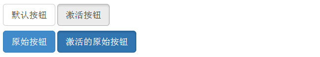
激活状态
按钮在激活时将呈现为被按压的外观(深色的背景、深色的边框、阴影)。
下表列出了让按钮元素和锚元素呈激活状态的 class:
| 元素 | Class | |
|---|---|---|
| 按钮元素 | 添加 .active class 来显示它是激活 | |
| 锚元素 | 添加 .active class 到 <a> 按钮来显示它是激活的。 |
下面的实例演示了这点:
<!DOCTYPE html><html><head>
   <title>Bootstrap 实例 - 按钮激活状态</title>
   <link rel="stylesheet"
   href="//apps.bdimg.com/libs/bootstrap/3.3.0/css/bootstrap.min.css"
   rel="external nofollow" target="_blank"  rel="external nofollow"
   target="_blank"  rel="external nofollow" target="_blank"
   rel="external nofollow" target="_blank"  rel="external nofollow"
   target="_blank" >
   <script src="//apps.bdimg.com/libs/jquery/2.1.1/jquery.min.js"
   rel="external nofollow"  rel="external nofollow"  rel="external nofollow"
   rel="external nofollow"  rel="external nofollow" ></script>
   <script src="//apps.bdimg.com/libs/bootstrap/3.3.0/js/bootstrap.min.js"
   rel="external nofollow"  rel="external nofollow"  rel="external nofollow"
   rel="external nofollow"  rel="external nofollow" ></script></head><body><p>
   <button type="button" class="btn btn-default btn-lg ">
      默认按钮   </button>
   <button type="button" class="btn btn-default btn-lg active">
      激活按钮   </button></p><p>
   <button type="button" class="btn btn-primary btn-lg ">
      原始按钮   </button>
   <button type="button" class="btn btn-primary btn-lg active">
      激活的原始按钮   </button></p></body></html>
结果如下所示:
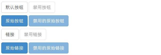
禁用状态
当您禁用一个按钮时,它的颜色会变淡 50%,并失去渐变。
下表列出了让按钮元素和锚元素呈禁用状态的 class:
| 元素 | Class |
|---|---|
| 按钮元素 | 添加 disabled 属性 到 <button> 按钮。 |
| 锚元素 | 添加 disabled class 到 <a> 按钮。 |
注意:该 class 只会改变 <a> 的外观,不会改变它的功能。在这里,您需要使用自定义的 JavaScript 来禁用链接。
下面的实例演示了这点:
<!DOCTYPE html><html><head>
   <title>Bootstrap 实例 - 按钮禁用状态</title>
   <link rel="stylesheet"
   href="//apps.bdimg.com/libs/bootstrap/3.3.0/css/bootstrap.min.css"
   rel="external nofollow" target="_blank"  rel="external nofollow"
   target="_blank"  rel="external nofollow" target="_blank"
   rel="external nofollow" target="_blank"  rel="external nofollow"
   target="_blank" >
   <script src="//apps.bdimg.com/libs/jquery/2.1.1/jquery.min.js"
   rel="external nofollow"  rel="external nofollow"  rel="external nofollow"
   rel="external nofollow"  rel="external nofollow" ></script>
   <script src="//apps.bdimg.com/libs/bootstrap/3.3.0/js/bootstrap.min.js"
   rel="external nofollow"  rel="external nofollow"  rel="external nofollow"
   rel="external nofollow"  rel="external nofollow" ></script></head><body><p>
   <button type="button" class="btn btn-default btn-lg">
      默认按钮   </button>
   <button type="button" class="btn btn-default btn-lg" disabled="disabled">
      禁用按钮   </button></p><p>
   <button type="button" class="btn btn-primary btn-lg ">
      原始按钮   </button>
   <button type="button" class="btn btn-primary btn-lg" disabled="disabled">
      禁用的原始按钮   </button></p><p>
   <a href="#" class="btn btn-default btn-lg" role="button">
      链接   </a>
   <a href="#" class="btn btn-default btn-lg disabled" role="button">
      禁用链接   </a></p><p>
   <a href="#" class="btn btn-primary btn-lg" role="button">
      原始链接   </a>
   <a href="#" class="btn btn-primary btn-lg disabled" role="button">
      禁用的原始链接   </a></p></body></html>
结果如下所示:
按钮标签
您可以在 <a>、<button> 或 <input> 元素上使用按钮 class。但是建议您在 <button> 元素上使用按钮 class,避免跨浏览器的不一致性问题。
下面的实例演示了这点:
<!DOCTYPE html><html><head>
   <title>Bootstrap 实例 - 按钮标签</title>
   <link rel="stylesheet"
   href="//apps.bdimg.com/libs/bootstrap/3.3.0/css/bootstrap.min.css"
   rel="external nofollow" target="_blank"  rel="external nofollow"
   target="_blank"  rel="external nofollow" target="_blank"
   rel="external nofollow" target="_blank"  rel="external nofollow"
   target="_blank" >
   <script src="//apps.bdimg.com/libs/jquery/2.1.1/jquery.min.js"
   rel="external nofollow"  rel="external nofollow"  rel="external nofollow"
   rel="external nofollow"  rel="external nofollow" ></script>
   <script src="//apps.bdimg.com/libs/bootstrap/3.3.0/js/bootstrap.min.js"
   rel="external nofollow"  rel="external nofollow"  rel="external nofollow"
   rel="external nofollow"  rel="external nofollow" >
   </script></head><body><a class="btn btn-default"
   href="#" role="button">链接</a><button class="btn btn-default"
   type="submit">按钮</button><input class="btn btn-default"
   type="button" value="输入"><input class="btn btn-default"
   type="submit" value="提交"></body></html>
结果如下所示:

Mos固件,小电视必刷固件
ES6 教程
Vue.js 教程
JSON 教程
jQuery 教程
HTML 教程
HTML 5 教程
CSS 教程
CSS3 教程
JavaScript 教程
DHTML 教程
JSON在线格式化工具
JS在线运行
JSON解析格式化
jsfiddle中国国内版本
JS代码在线运行
PHP代码在线运行
Java代码在线运行
C语言代码在线运行
C++代码在线运行
Python代码在线运行
Go语言代码在线运行
C#代码在线运行
JSRUN闪电教程系统是国内最先开创的教程维护系统, 所有工程师都可以参与共同维护的闪电教程,让知识的积累变得统一完整、自成体系。
大家可以一起参与进共编,让零散的知识点帮助更多的人。
X

选择支付方式:


立即支付
¥
9.99
无法付款,请点击这里
金额: 0 元
备注:
转账时请填写正确的金额和备注信息,到账由人工处理,可能需要较长时间
备注:
转账时请填写正确的金额和备注信息,到账由人工处理,可能需要较长时间
如有疑问请联系QQ:565830900
正在生成二维码, 此过程可能需要15秒钟